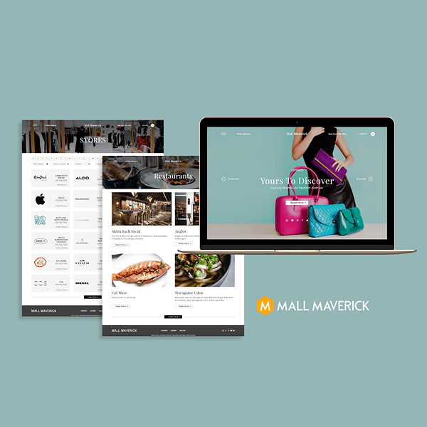
Mall Maverick
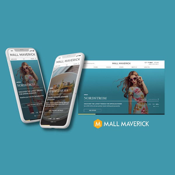
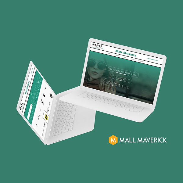
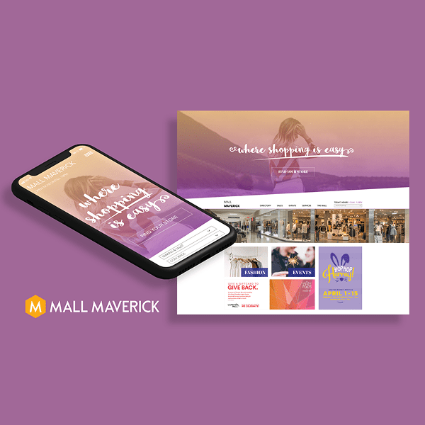
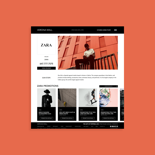
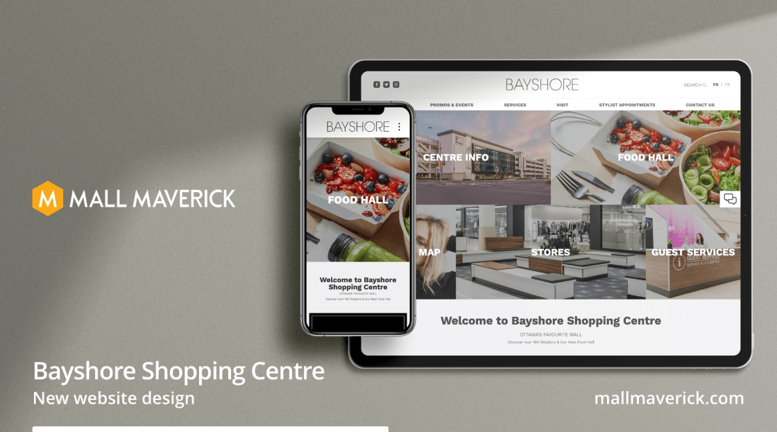
Mall Maverick provides digital tools for shopping centers, but their branding lacked the consistency and clarity needed to scale. I led a comprehensive overhaul of the brand system, refining the logo, typography, color usage, and layout rules, while building practical, scalable guidelines for internal and client-facing assets.
Problem Statement
The existing brand lacked structure and visual consistency across platforms. Logo use was inconsistent, typography choices varied, and there were no clear standards for applying brand assets across different mediums. This made it difficult to create cohesive designs for clients or maintain credibility as a digital partner to major malls.
Solution Statement
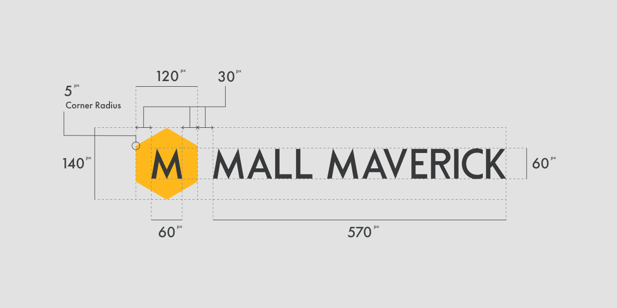
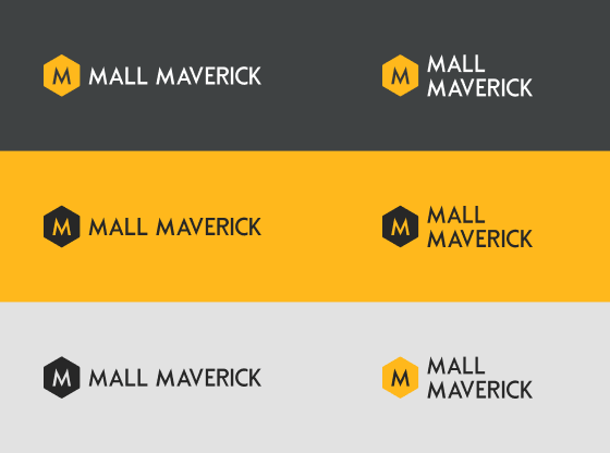
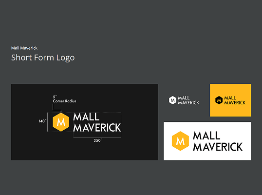
I rebuilt the brand from the ground up by establishing a detailed visual language and modular system. This included updated logo construction, a defined color palette with hex and accessibility considerations, paired fonts with clear usage roles, and layout rules for digital and print materials. The new system makes it easy for design and marketing teams to build polished, consistent communications.


Goals
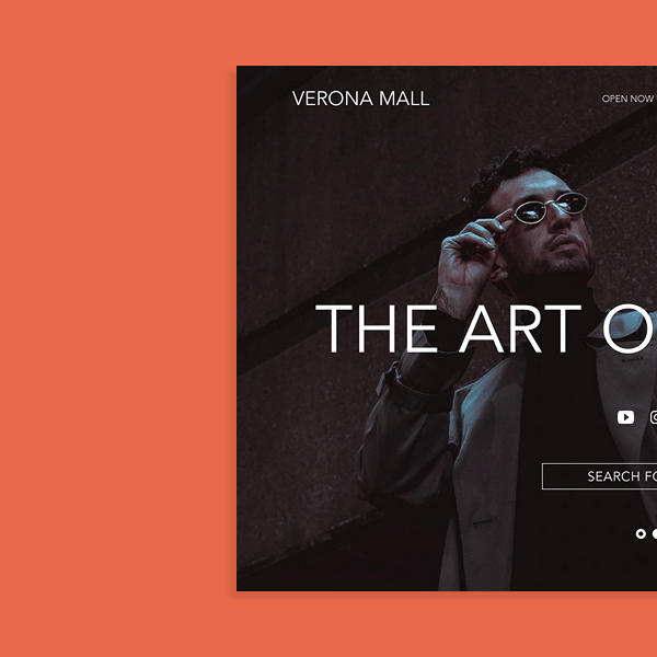
I set out to bring clarity, flexibility, and polish to a brand used across dozens of retail websites and partner projects.
- Refine the logo structure and introduce a modular version for flexible use
- Establish guidelines for typography, color, and layout across digital and print
- Create a scalable system that supports internal use and client-facing assets
- Improve overall brand trust and consistency through clear visual rules
Accomplishments
The updated brand system brought cohesion across the entire Mall Maverick ecosystem.
- Designed a detailed brand guide with rules for logo usage, spacing, and background contrast
- Introduced Futura PT and Open Sans with defined roles for headings and body content
- Made branding more accessible and future-proof for both internal teams and external vendors